
TL;DR: The datavessel web chat now renders interactive charts directly in the conversation. Ask about traffic trends, revenue breakdowns, or device splits — and see the answer as a chart, not a wall of numbers. Line, area, bar, and pie charts, all inline.
Text answers are great for specific questions. “What was last week’s revenue?” — you want a number.
But some questions need a picture. “How has traffic changed over the past 30 days?” A table of 30 rows tells you the data. A chart tells you the story.
The datavessel web chat now renders both.
Ask a Question, See a Chart
When you ask the agent something that’s better understood visually, it renders an interactive chart right in the conversation — alongside its text analysis.
No exporting to spreadsheets. No switching to a dashboard. You ask, you see.
The Right Chart for the Question
The agent picks the chart type that fits the data:
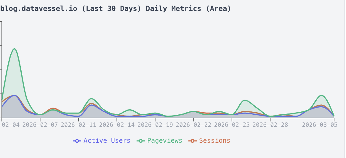
- Line and area charts — Traffic trends, session counts, revenue over time
- Bar charts — Revenue by channel, category comparisons, top pages
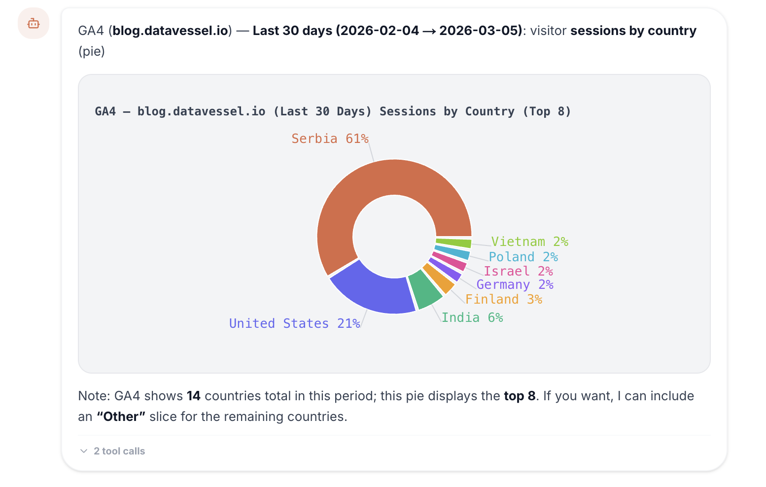
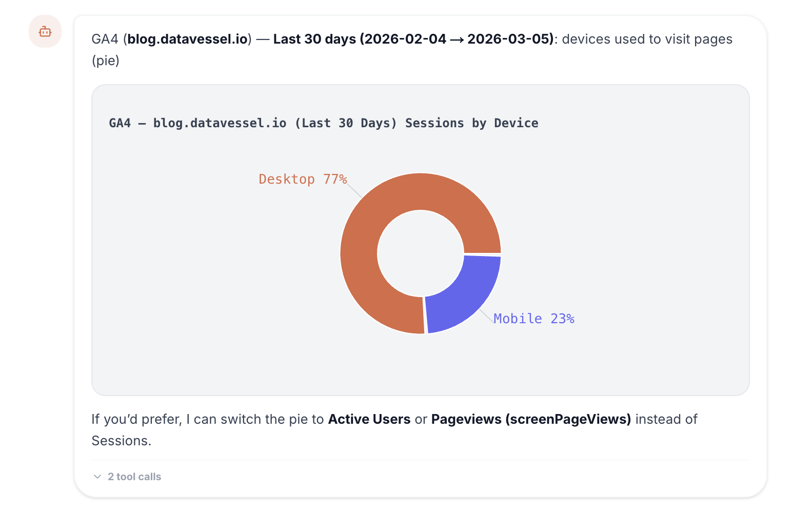
- Pie charts — Traffic source distribution, device breakdowns, audience segments
Charts include hover tooltips and are fully responsive inside the chat. Multiple charts can appear in a single response, mixed with the agent’s text analysis.
Natural Data Exploration
This changes how you explore data. Instead of knowing which dashboard to open and which filters to set, you just ask:
- “Show me traffic trends for the last 30 days”
- “Break down revenue by channel”
- “What’s my traffic source distribution?”
- “Compare this month’s sessions to last month”
The agent pulls the data, picks the right visualization, and renders it — with context about what the numbers mean. It’s the difference between reading a report and having a conversation about your data.
Why This Matters
Some patterns are invisible in tables. A gradual traffic decline over 30 days looks like minor fluctuations in rows of numbers. In a chart, the trend is obvious at a glance.
Charts make data exploration faster and more intuitive — especially for team members who aren’t analysts. Ask a plain English question, get a visual answer. No training required.
Try It
Inline charts are live in the datavessel web chat for all users. Connect a data source and start asking.
Leave a Reply